April 19, 2022
How visual dashboards are giving scientists and community conservationists a fighting chance to protect and restore one of the world’s living wonders.
Stretching over 2300 kilometres, you’re probably familiar with the Great Barrier Reef – the biggest living structure on earth as well as one of the most significant, right on Australia’s doorstep.
Along with the stunning coral and marine life, you’re probably also familiar with images of bleaching, the white coral now distressingly synonymous with the impacts of climate change and rising sea temperatures.
But what you might not be as familiar with are the visual dashboards helping track and tell the story of the world’s largest collective effort to help an ecosystem withstand the impacts of climate change. These dashboards are colourful, engaging and chock-full of data. Here’s how we got involved.
2018 saw the beginning of the Reef Trust Partnership, a six-year $443m partnership between the Australian Government’s Reef Trust and the Great Barrier Reef Foundation, aimed at “achieving significant, measurable improvement in the health of the Great Barrier Reef”. Efforts range from improving the quality of water running into the Reef catchment, enhancing the engagement of Traditional Owners and the broader community in Reef protection, and trialling innovative approaches to reef restoration.
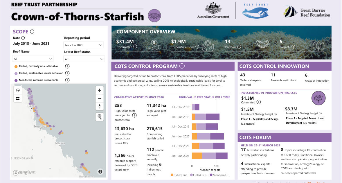
To date, more than 200 projects are underway with the support of over 400 partners, all working to improve the health of the Reef in this critical period of action. But the unprecedented scale of the investment – along with the sheer immensity and complexity of the Reef itself – represents one of the greatest challenges in meeting the Partnership’s goal.
When you’re working on hundreds of reef-improvement initiatives with more than 30 Traditional Owner groups, over 1000 scientists, community conservationists, farmers and tourism operators across an area larger than the entire country of Italy – how and where do you begin to measure impact? How do you know what effect your efforts are having in such a delicate, interconnected and massive ecosystem?
Enter Clear Horizon. Working in partnership with the Great Barrier Reef Foundation, we’ve been developing the data and digital tools to track progress against the Partnership’s key three objectives and six areas of focus. And based on hundreds of data inputs – from working with landholders to reduce inorganic nitrogen entering waterways across the entire Reef coastline, to developing shading and cooling measures to prevent or reduce bleaching stress on corals, to co-designing a range of Traditional Owner-led Reef Protection activities and projects – a comprehensive picture is starting to emerge of how the efforts of the Partnership are contributing to change.
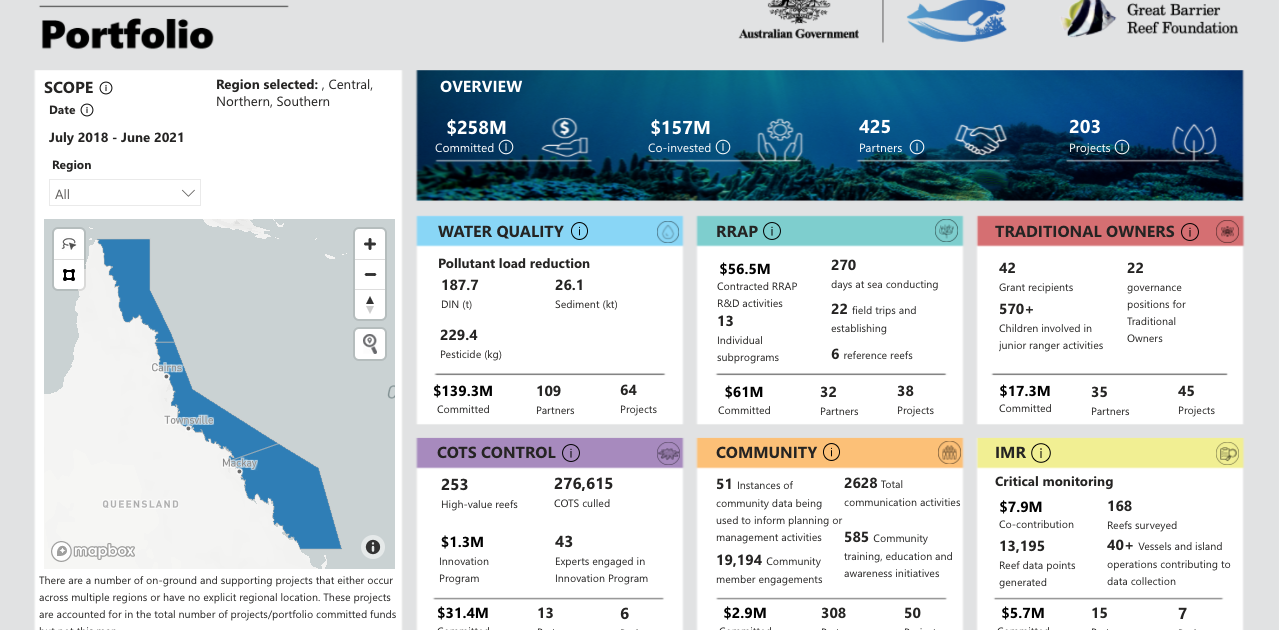
The series of interactive dashboards show the progress being made towards meeting each of the key outcomes, keeping partners, funders, community members and scientists on the same page as to what’s being achieved. And as the dashboards feature on the Reef Trust Partnership homepage on the Great Barrier Reef Foundation website, they’re also providing an unprecedented level of transparency and accountability to the broader public and stakeholders on this significant investment of public funds.
Finally, having ready access to comprehensive yet meaningful levels of data is also helping foster innovation and action research. With little time to waste, scientists and conservationists alike are live-testing and scaling new approaches based on promising research and pilots in the hope of achieving greater impact. And having a shared progress overview safeguards from common pitfalls in collective efforts such as siloed projects. It puts what the Partnership hopes to leverage – local knowledge and building on the insights of others – in plain sight.
While the dashboards are helping to transparently track the influence and progress that the Great Barrier Reef Foundation and its partners are having, more must be done nationally and globally to reduce the impacts of climate change if we are to see it thrive into the future. But it’s a promising, measurable start.
If you’d like to better collaborate, improve your reporting and support data-driven decision making, check out our self-paced course Using Power BI for Impact.

